Work/
Windows Core UX
My first full-time job out of college was as the Program Manager for Windows Personalization.
At the time the team was working to ship the first version of Windows 10, codenamed Threshold.
What is Windows Personalization?
Windows has always had a bunch of personalization functionality, and you’ve probably used a good chunk of it, perhaps even without knowing. Desktop wallpapers, accent and theme colors, sound schemes, lock screen image, fonts, the theme store, etc.
What may be less obvious are the complexities behind exposing these kind of customizations to users. A crash-course given to me on “accent color” by one of the team’s engineers quickly revealed that personalization features are not as trivial as I may have thought.
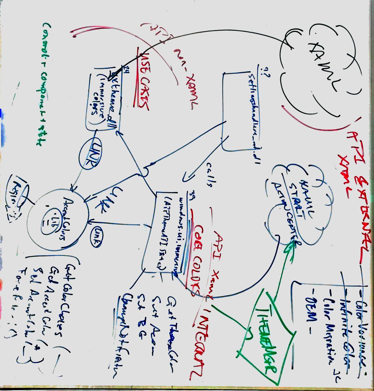
A deceptively easy feature pitch like “allow the user to choose a custom accent color” quickly cascades into an abundance of follow-ups.
What if the user chooses a color that doesn’t have enough contrast against the rest of our UI for legible text and buttons? How do we generate a “color ramp” for lighter/darker variants if the user selects too light or dark of a color? What should Narrator say when a custom color is highlighted? How can we guarantee that the user’s selection is respected across applications spanning a huge variety of platforms and UI frameworks?
There were plenty of interesting problems to solve here.
Notable Features
Dark Theme
The first version of Windows 10 actually shipped without a light/dark theme toggle. Though Universal Windows Apps could be written to support light or dark theming, the settings toggle to allow users to switch between light or dark was only available on Windows Phone. Desktop users were stuck on light mode.
The reason for this was largely legacy support. Phone had a fairly young set of applications that, for the most part, adhered to the theming APIs that were first exposed on Windows Phone 7. Desktop had a huge number of Win32 applications that did not.
The effect of this would be the user toggling the theme setting and observing only some of their applications respecting their preference. Would this an acceptable user experience? With a bit of work to make sure more applications listened to the right theming APIs, the team felt it was. That didn’t stop some clever users from finding a registry key to flip the setting ahead of us!
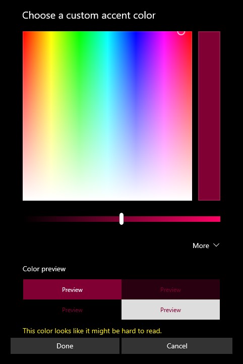
Custom Accent Picker
Since Windows Phone 7, users were provided a static list of accent colors for users to personalize their device with. These colors were curated by the design team, had their own respective “color ramps” for lighter and darker accent variants, and met accessibility requirements for contrast against text.
Sometimes 48 accent colors isn’t enough, and you want to personalize your device with your very own custom color shade. Why not let users select their own accent color? The main concern is that users may not be as forward-thinking as our design team in picking their preferred color. Not that the team was scared of a user picking an ugly color - but what if the user selected a color that prevented them from reading the text in their applications? Should we let the user shoot themselves in the foot?
In the end, our answer was yes. But with informed consent.
Windows 10 Shipped!
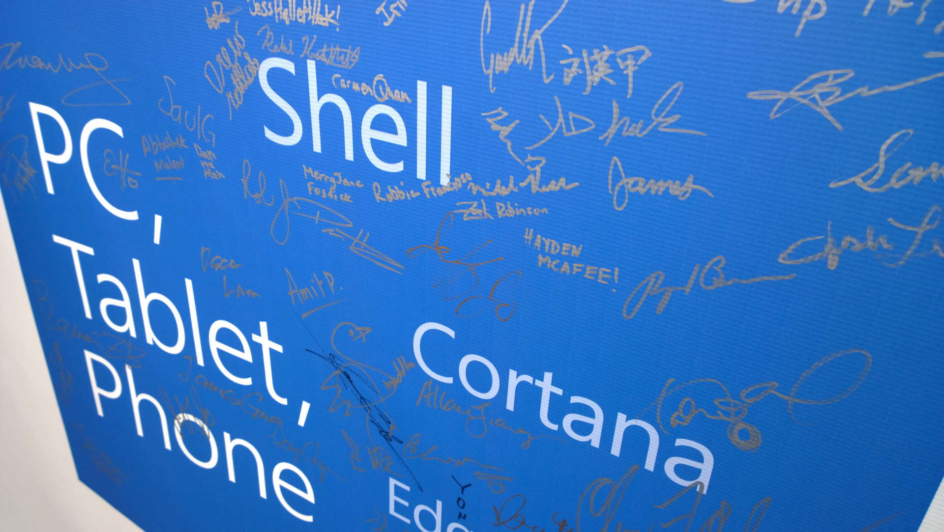 Hey look, there’s my signature!